Temporal Data Skeletons
This project was built with Mathis Chenuet, based on previous work from Félix Alié, Damien Delmas and Alexis Schad; under the supervision of the late and unforgettable Prof. Ghitalla.
About representing time in a network graph
The natural way to represent interaction between entities is as a network graph: Alice called Bob 42 times, she went to Charlie’s place twice a month… All these events can be represented as edges of a graph in which the vertices are the actors. However, we’ll be missing a crucial component: time.
Sure, it’s possible to treat the graph as a video, making edges appearing gradually, but the big picture won’t be visible.
To fix our thoughts, we’ll set the data to be the collection of messages sent from a phone.
The standard, non-network way
While it’s rather easy to visualize a message exchange between two people, it’s harder to visualize the interactions between someone and all his or her contacts in a single graph. A solution one could come up with would be to list all their contacts (sorted by ascending total message count) on the $y$ axis, put the time the $x$ one and plot dots or a heat map to represents messages.
Although this approach works and will be good enough 90% of the time, it’s not ideal as it’s definitely not compact enough when the number of contacts is rather high.
One could argue that a threshold on message count would solve this issue but that’s a straight information loss. We wondered how we could do things differently.
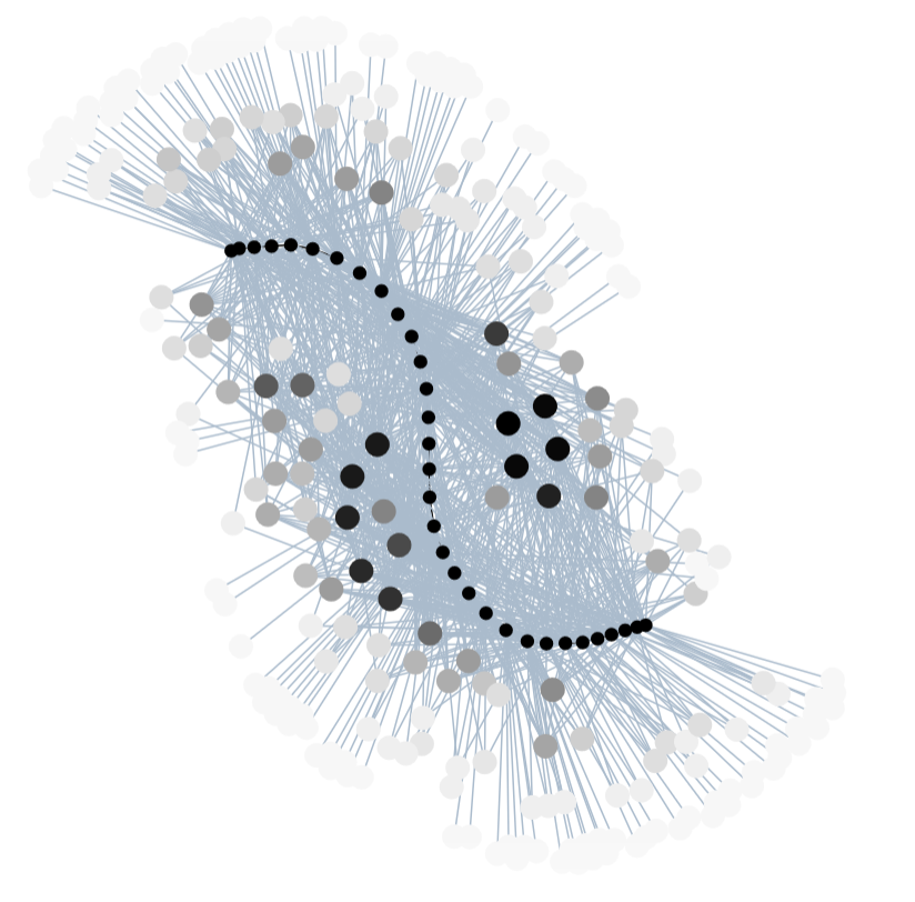
Materializing time
The main idea is to represent time as a series of nodes in a graph, a “skeleton” of timestamps. Entities are then linked to some of the skeleton’s vertebras by an edge if something related to it happened during the time range materialized by the vertebra, creating a bipartite graph. The edges can also be weighted by “how much of it” happened during that range.
Following these rules we can create a human-unreadable graph:
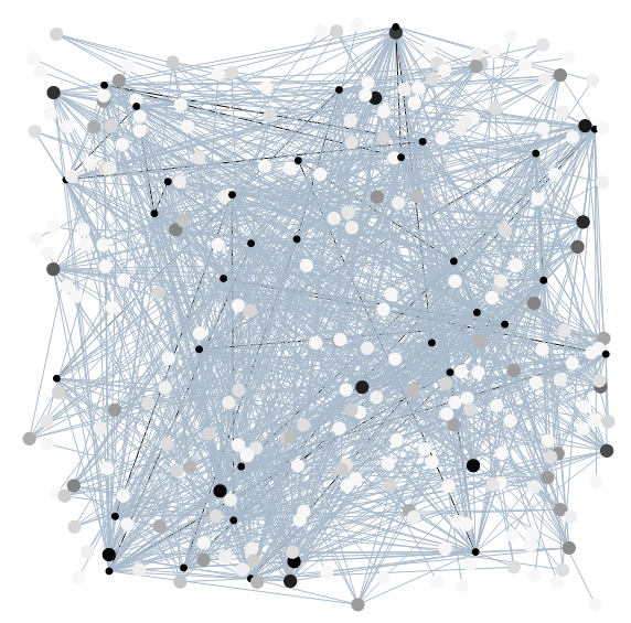
Once the structure of the graph is built, the nodes must be positioned correctly to make it interpretable. To achieve this we used a force-directed graph drawing algorithm: ForceAtlas2.
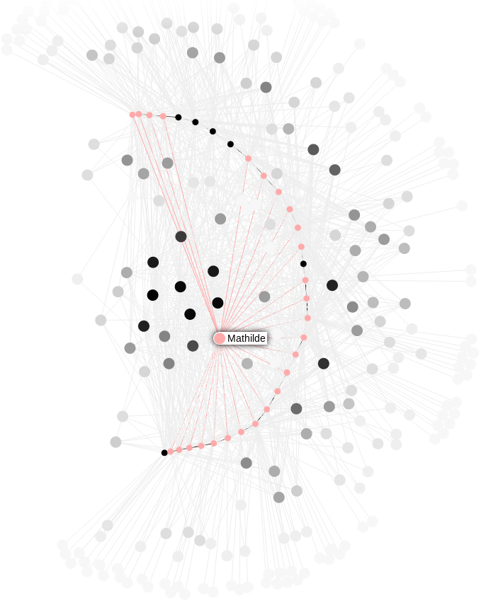
Bending time
In order to give a proper shape to the “skeleton” timeline, we essentially increased the attraction between two vertebra nodes and voilà: the graph instantly becomes more coherent with an easy to follow timeline. Entities are placed according to when they interacted with the skeleton which makes global behaviors easy to grasp.
With a few cosmetic adjustments the result is quite nice one the eyes !
As for the technology, we used sigma-js to handle most the graph-related stuff.
This representations is unique as it allows for an overview of relations between the subject and the entites he interacted with. The concept can easily be extended to multiple subjects with interwining skeletons.
What kind of data ?
This visualization technique applies to sets of (label, sequence-number) pairs, in most use-cases the sequence-number is a timestamp but it doesn’t inherently have to be time-related.
We built a demo tool that takes a CSV as input for you to try: